How is this Game Rendered?
UPDATE: This article about an experimental rendering process is also up on IndieDB... https://www.indiedb.com/company/michael-klaus-schmidt/features/how-is-this-game-...
I started this game with a very simple idea in mind. I wanted to come up with a different way to render a 3D level. I'm going to share the techniques and thought process behind it here.
Vector Graphics:
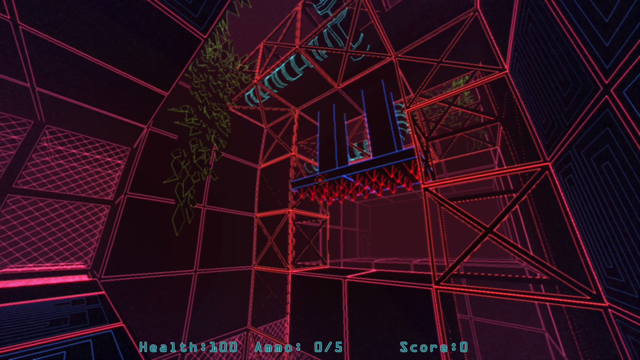
First, I am working on another game, a much larger, more complex game called Paradox Vector. That game uses 3D line draw commands to emulate the vector graphics games of the early 1980's. It is my feeling that vector graphics are a source for real artistic potential that has remained untapped for the past few decades, since raster graphics effectively took over the video game scene.
Paradox Vector attempt to look like those early arcade games, but it also tries to create a more complex world than any vector graphics games were able to. 
A Different Approach:
Horror in the museum does not look like a vector graphics game at all, but it actually is. Allow me to explain. Instead of using vector lines to draw the outlines or shapes of game objects, as I do in Paradox Vector, I decided to use them to define the space between objects, the negative space.
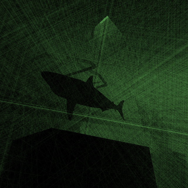
The green fog you are seeing is not typical 3D "fog" but actually a large number of straight lines that are drawn each frame, in a pattern around the player's camera. They extend in all directions, some being roughly parallel to the player's view, while others perpendicular, and still others traversing the player's view at various angles.
Here's what the game looks like at its full resolution...
This is not some kind of 2D filter placed over the image, but the 3D lines themselves. As the camera sees further, it can see more of these lines in the distance, and the "fog" therefore gets brighter, as more lines overlap one another. The dark shapes stand out as they effectively hide any lines that would be drawn through or behind them.
Originally I had lines drawing all at right angles to one another. This created a grid-like effect and I found it very interesting. It definitely provided a different feeling, but it looked too calm and organized for a horror game. I later added lots of different angles to the lines, and also caused the lines to switch directions randomly, to create the flashing, strobing effect. Here's what it looked like when the lines were all perpendicular and static...
I think this is something with a lot of potential, that I would also like to explore further, but perhaps in a different game.
Some things like the sky and reflective water are done with the standard, built-in rendering tools that come with any 3D engine. Those have nothing to do with the 3D lines.
Why 64 x 64?
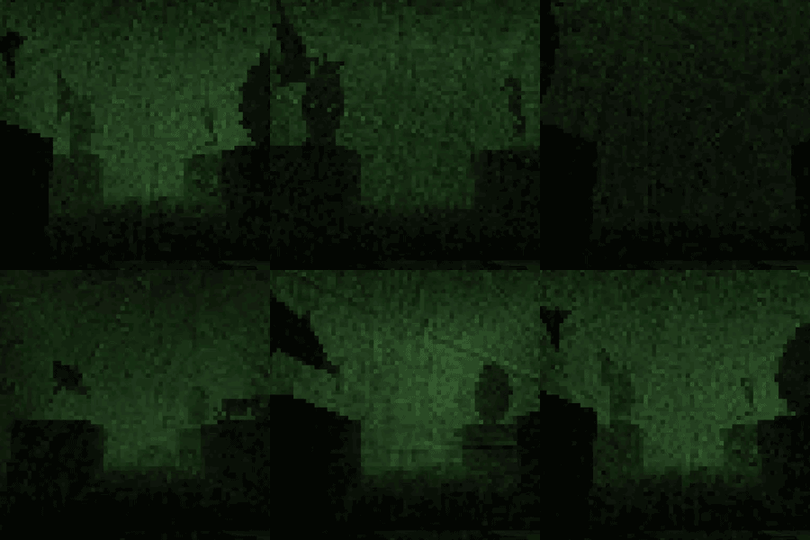
I reduced the screen resolution to 64 x 64 pixels just to be able to submit this to LowRezJam. So, while the scenes are created with vector lines, the game's camera filter ends up converting it into a low resolution pixel game. It reduces the resolution and gives the impression of some kind of scratched film effect.

Why Am I Doing This?
Working on Paradox Vector made me realize the vast potential of vector graphics in terms of offering new ways of generating imagery. I just think it's something that has not been deeply explored since the 1980s, and I think it has a lot of potential. I would love to see other game developers taking up this idea, to explore it further.
In this case, I feel like the experiment was a success. I used vector graphics to create a different way of rendering a 3D scene. I was surprised that it ended up looking so much like the standard 3D fog, but it also has its own distinct look and feel. Ultimately, I feel I accomplished what I had set out to do. I hope to hear any thoughts or feedback you might have about this method, or about my other games. I am also happy to answer any questions you may have.
Get Horror in the Museum
Horror in the Museum
A short, horror, walking simulator
| Status | Prototype |
| Author | Schmidt Workshops |
| Genre | Simulation |
| Tags | 3D, Horror, Lovecraftian Horror, LOWREZJAM, Walking simulator |
| Accessibility | Textless |
More posts
- Actual Gameplay - Version 0.09Aug 09, 2020
- Fixed ResolutionAug 09, 2020
- Testing Version 0.06 is UpAug 08, 2020
- Frame Rate ImprovedAug 07, 2020
- Testing Version UploadedAug 07, 2020
- Starting on the HorrorAug 03, 2020
- Added Sounds and Updated LevelAug 03, 2020
Comments
Log in with itch.io to leave a comment.
I find the technique interesting, but probably not here? I mean, a single noise texture could probably do the same effect in low res and much faster.
I do like how it looks in high res, though. And it's a nice experimenting regardless.